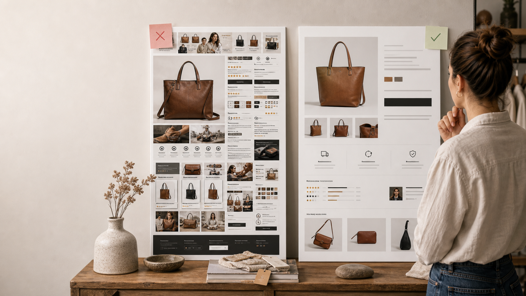
Many merchants choose or customize themes based on aesthetic confidence first. That makes sense up to a point. But some storefronts become more interested in appearing premium than in helping buyers decide.
When the page hierarchy weakens, reassurance gets buried, and product choices become harder to interpret, the theme starts taxing conversion.
The real goal is not a beautiful store in isolation. It is a store that looks strong while staying easy to understand.
Visual polish does not replace decision support
A buyer may enjoy the look of a page and still leave uncertain about the product. That gap matters because clarity is what moves the purchase forward.
Design earns attention. Structure earns trust.
- Clear product framing
- Visible hierarchy
- Simple option selection
- Risk answers near the buy decision
Theme problems often show up as subtle friction
Merchants do not always notice the damage because the site still feels premium. The friction often hides inside weak sequencing, decorative clutter, or hard-to-scan layouts.
That kind of friction is easy to excuse internally and expensive externally.
- Important content pushed too low
- Too much visual weight on non-decision elements
- Weak separation between product facts and style language
- Mobile layouts that prioritize appearance over speed
The best-looking stores usually feel calm, not complicated
The premium stores that convert well are usually restrained. They know what to emphasize and what to remove.
That restraint helps the buyer understand the product faster instead of admiring the page while still feeling uncertain.
- Fewer competing modules
- Stronger visual hierarchy
- Cleaner spacing around core decisions
- More confidence in simple presentation
What to fix this week
Pick one visually strong page and review it only through the lens of buying effort. Ignore whether it looks good and ask whether it helps a buyer decide quickly.
If the answer is no, fix the hierarchy before you change the style again.
- Audit one page for buyer effort
- Reduce one decorative distraction
- Move one critical reassurance element higher
- Check mobile hierarchy, not just desktop polish