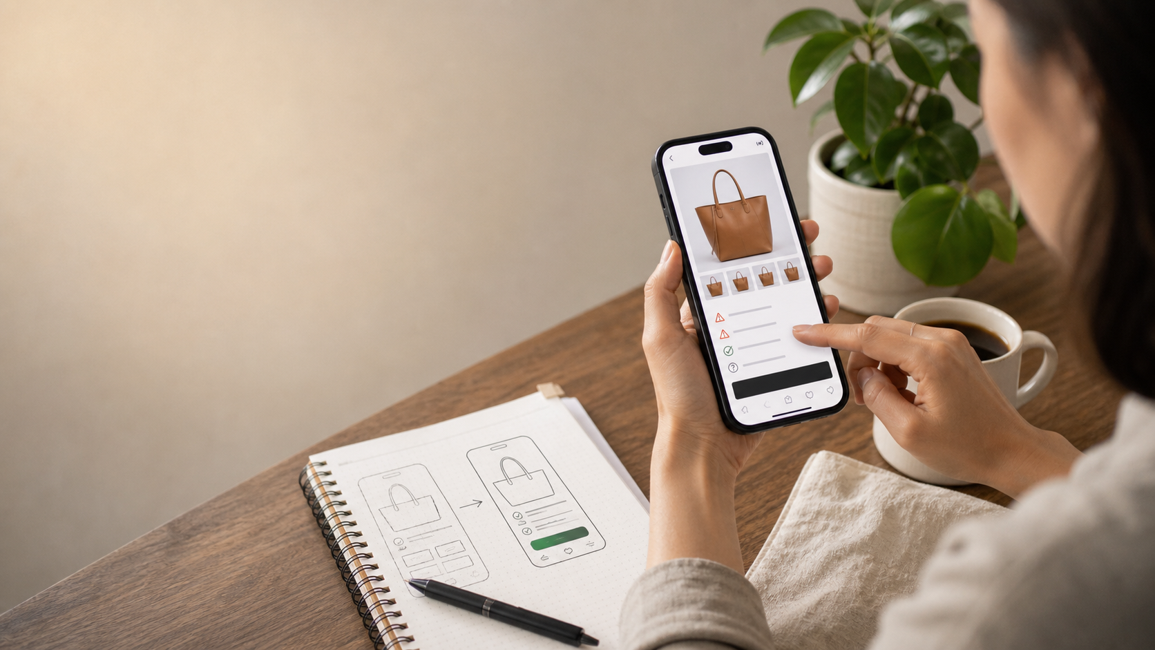
Merchants often blame acquisition when conversion stalls, even though the real problem sits on the product page. On mobile, weak ordering, hidden reassurance, and overloaded modules become more expensive.
A buyer who might tolerate mild friction on desktop often drops faster on a phone. Attention is thinner, comparison is harder, and trust cues need to appear earlier.
That is why mobile product-page audits usually produce better returns than buying another wave of traffic.
Mobile friction hides inside normal-looking pages
A page can look acceptable in design review and still be hard to buy from on a phone. The problem is often not visual polish. It is ordering, spacing, and decision flow.
When critical details sit too low, or the page makes the buyer bounce between modules, intent starts leaking.
- Important reassurance appears too late
- Images take too much space without helping decisions
- Variant selection feels cramped or confusing
- Policy cues are distant from the buy action
Mobile buyers need faster confidence, not smaller desktop pages
The strongest mobile pages are not just tighter. They are better prioritized. They show what matters first and reduce effort per screen.
That means merchants should judge mobile pages by decision speed, not only by brand appearance.
- Clarify the product immediately
- Surface delivery and return confidence earlier
- Keep the buy path easy to re-find
- Use fewer decorative interruptions
Fixing mobile friction improves paid traffic efficiency too
When mobile buyers drop because the page is hard to use, merchants often respond by increasing acquisition. That masks the real loss point instead of fixing it.
A better mobile PDP does not just help conversion rate. It helps the economics of every paid session you already buy.
- Higher quality from existing traffic
- Less wasted intent from ads and social clicks
- Stronger repeat visit performance
- More consistent cross-device buying behavior
What to fix this week
Open your top three product pages on a real phone and try to buy like a first-time customer. Note every place where you hesitate, scroll too far, or lose the buying thread.
Then fix the first-screen priorities before you buy more traffic. Mobile usually tells you where your store is asking too much from the buyer.
- Audit top products on a phone, not only in browser preview
- Move one key trust signal higher
- Tighten the sequence around images, options, and reassurance
- Reduce one unnecessary content block